PLNT - 2024-2026
CREATIVE DIRECTION + BRAND STRATEGY
“Reframing a traditionally functional category through a fashion-led, design-conscious lens.”
-
PLNT began as an idea to disrupt a category that had traditionally been functional, safe and visually predictable. Working directly with the founders, I helped shape the business from the ground up — from the product concept and name through to the positioning, identity and customer experience.
The opportunity was to take artificial plants out of the traditional interiors space and build a brand that behaved more like fashion. PLNT was created around the idea of blending nature and style: premium, design-led artificial plants for customers who saw their homes as an extension of their personal aesthetic. The proposition was simple: statement greenery without the maintenance, underpinned by the line “Style that never dies.”
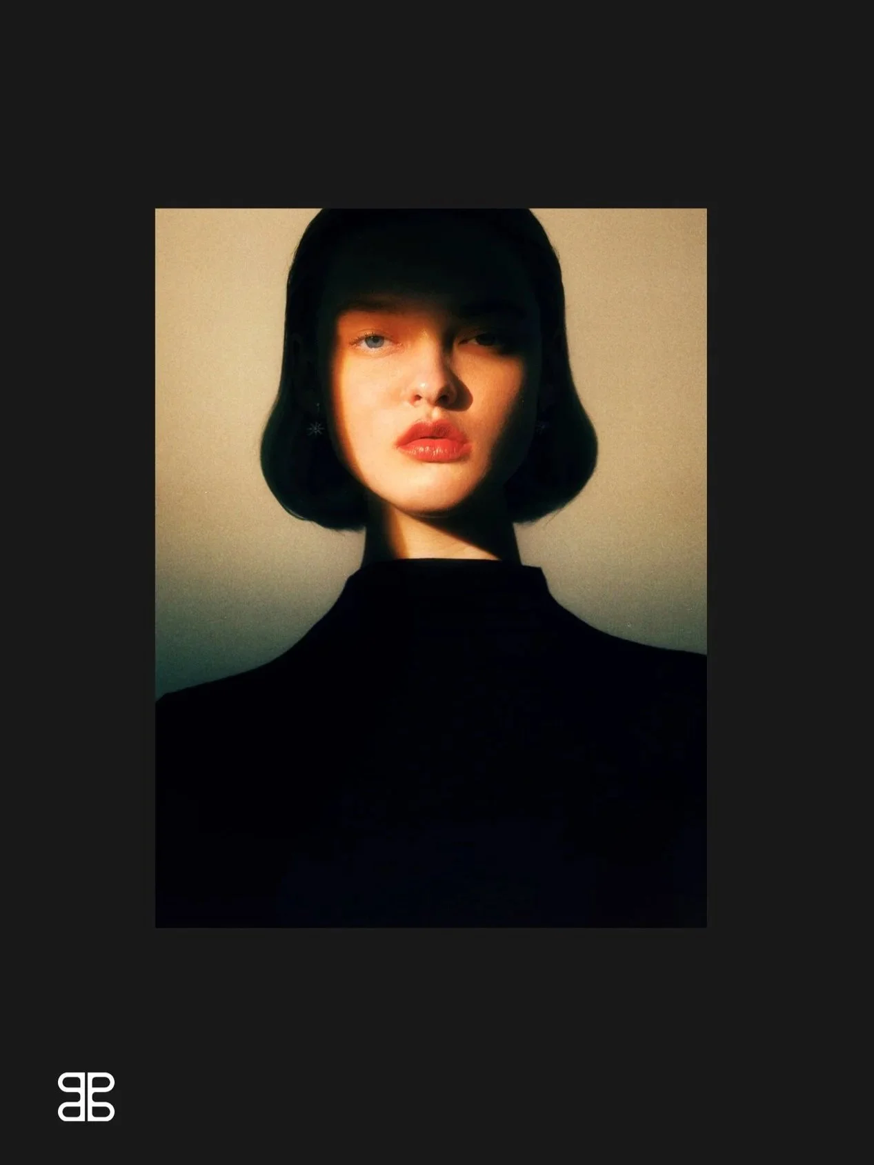
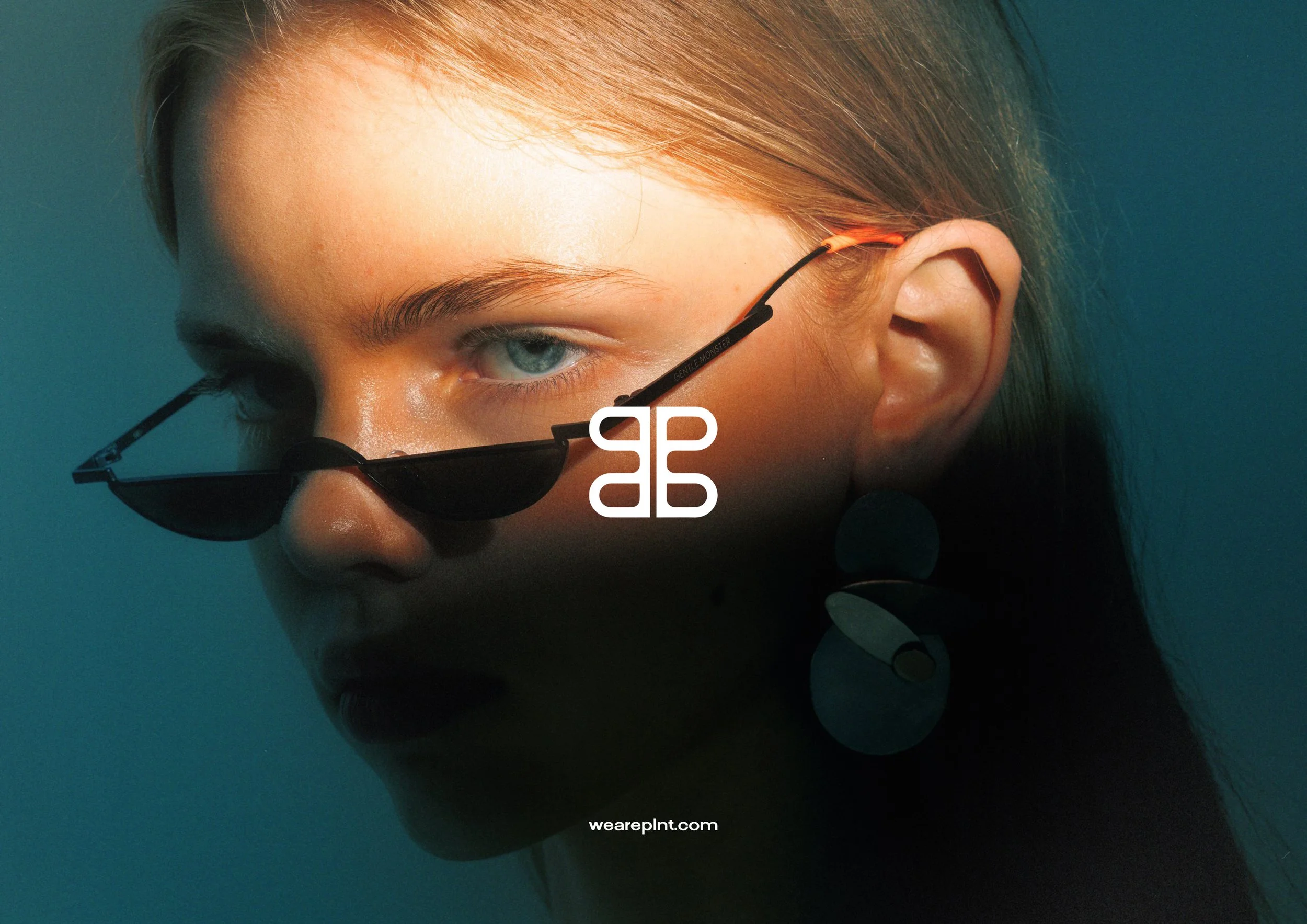
Rather than compete through practicality alone, we built PLNT around attitude. Subtly sexy, confident and unexpected, with a visual world influenced by high fashion and luxury rather than conventional homeware.
-
I led the creative and brand development end-to-end to turn the initial concept into a fully realised consumer brand. This included naming PLNT, helping conceptualise the product proposition, defining the brand strategy and audience, and building the complete visual and verbal identity.
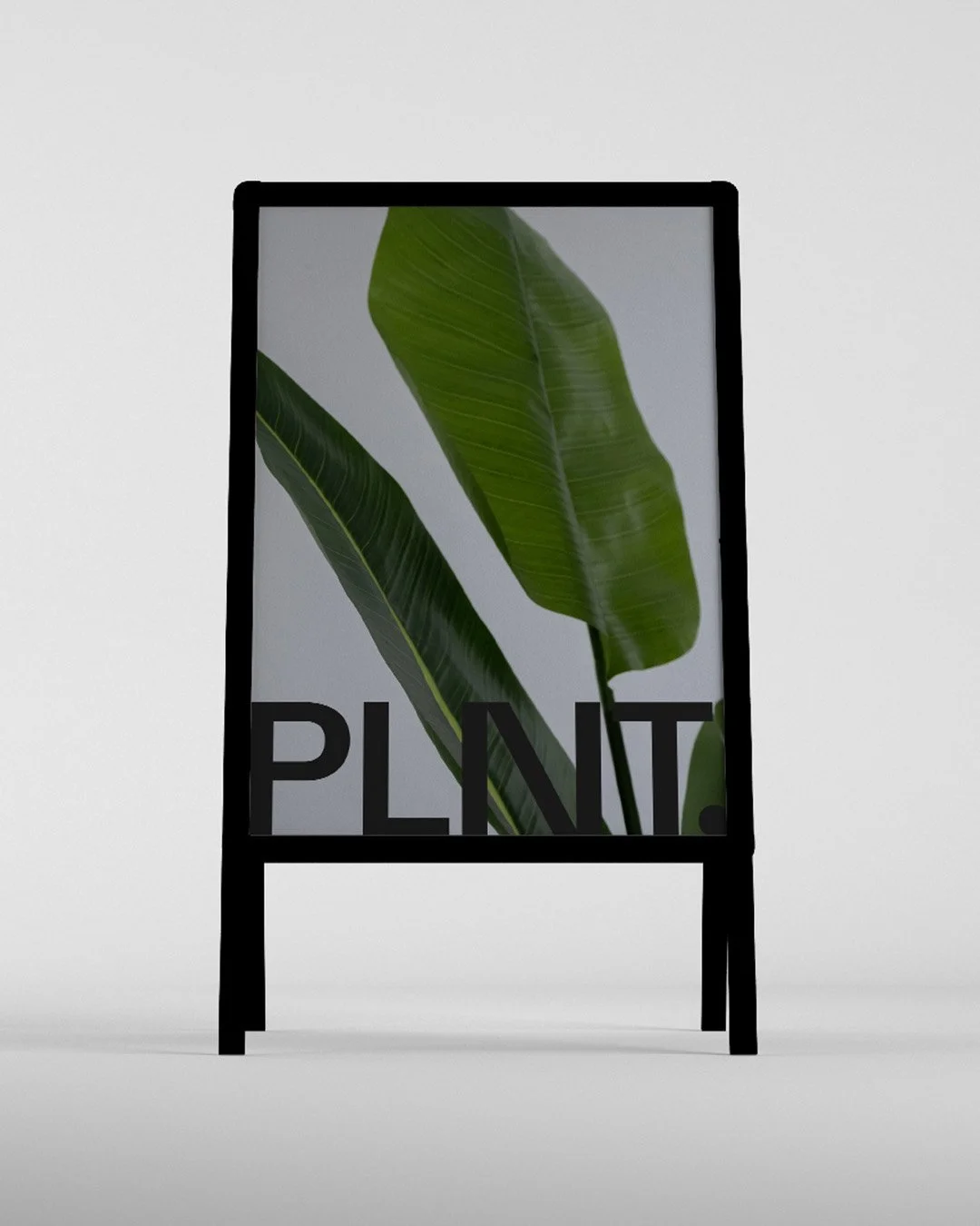
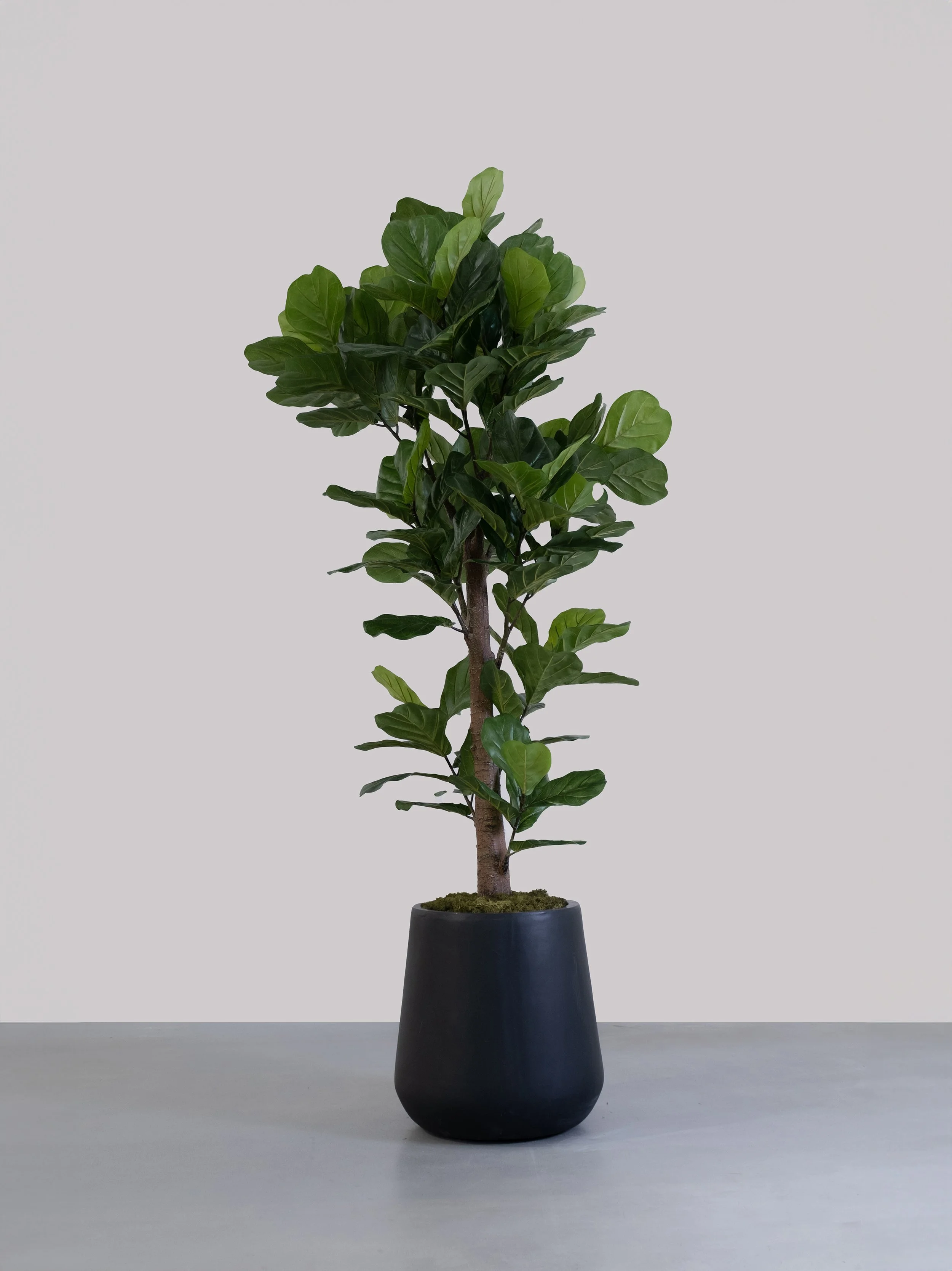
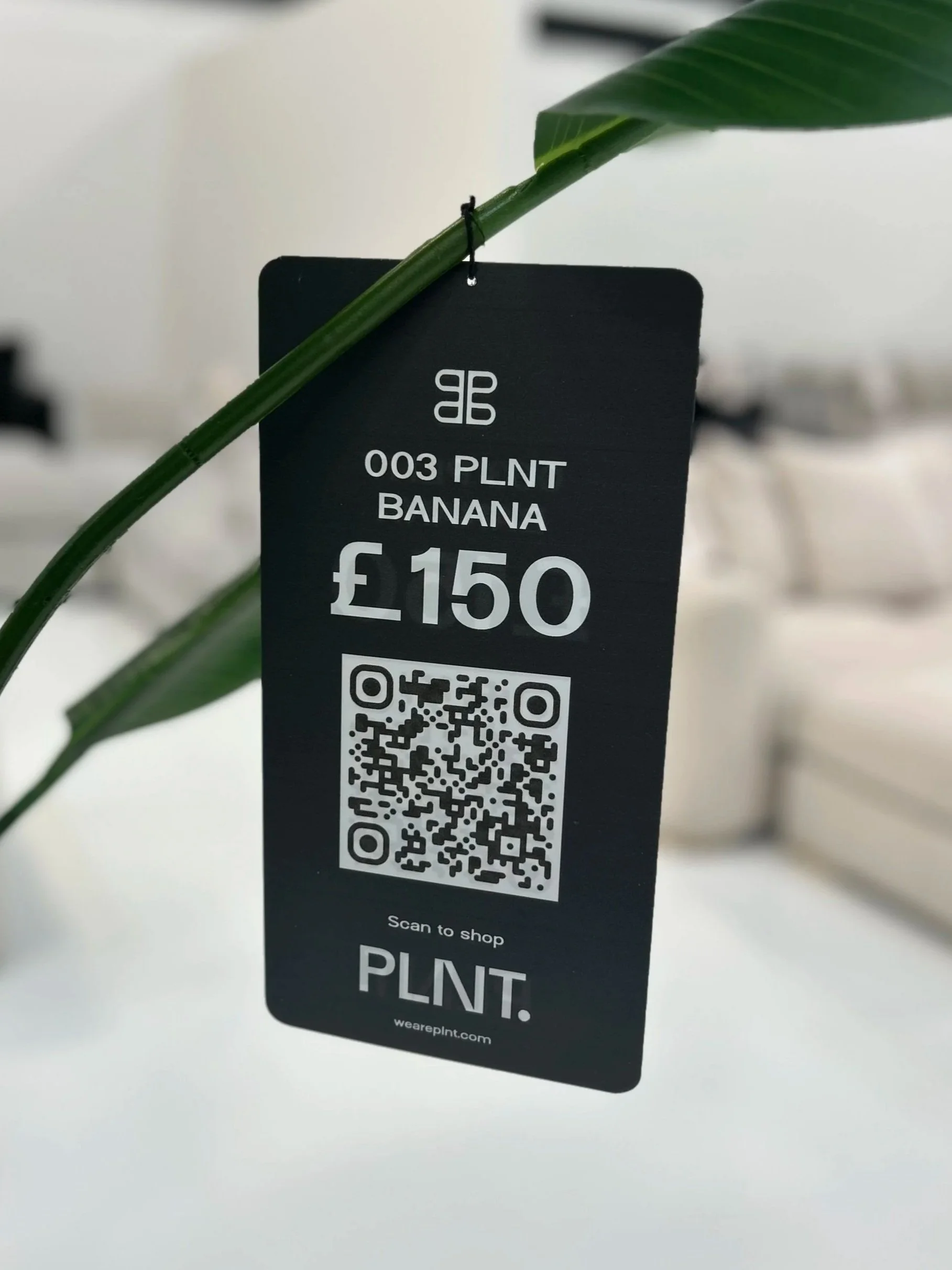
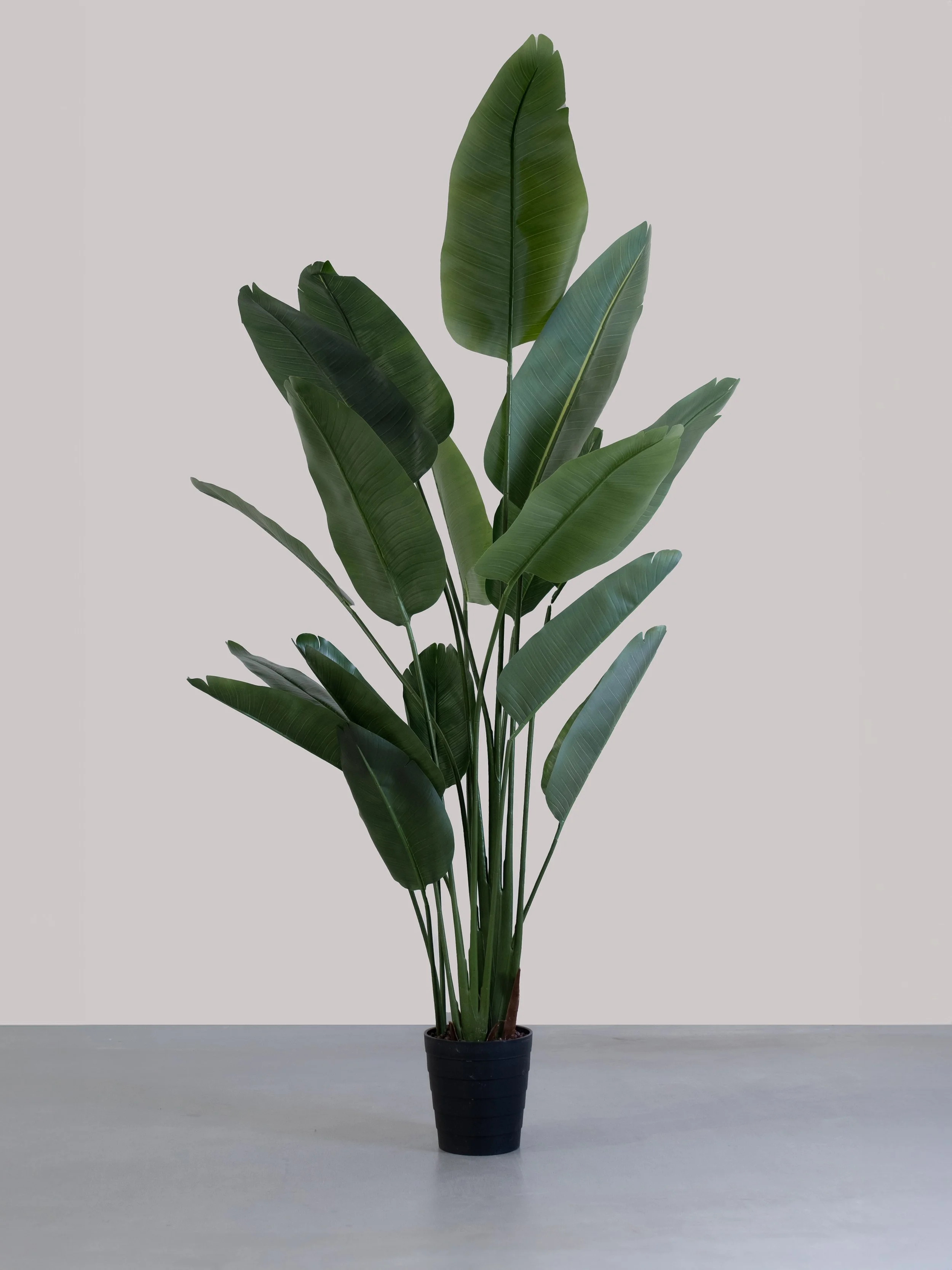
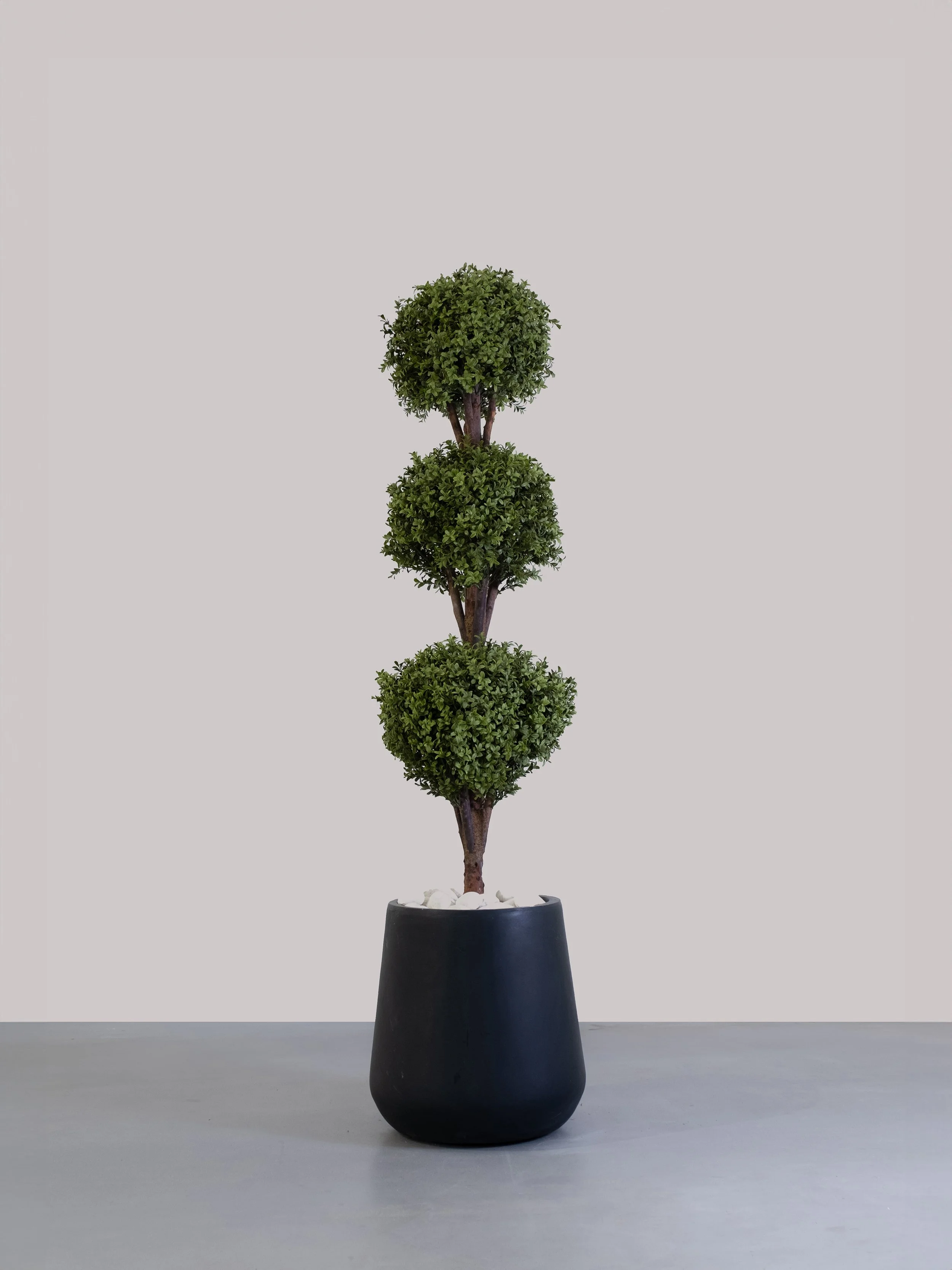
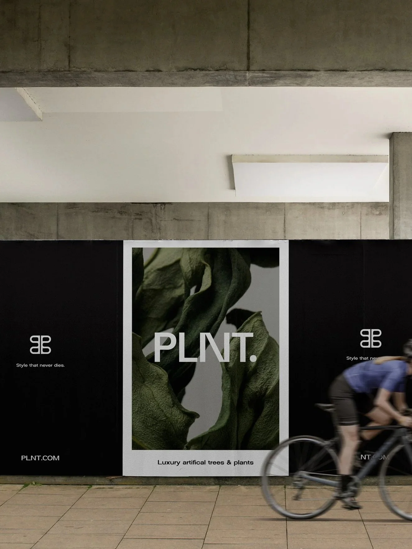
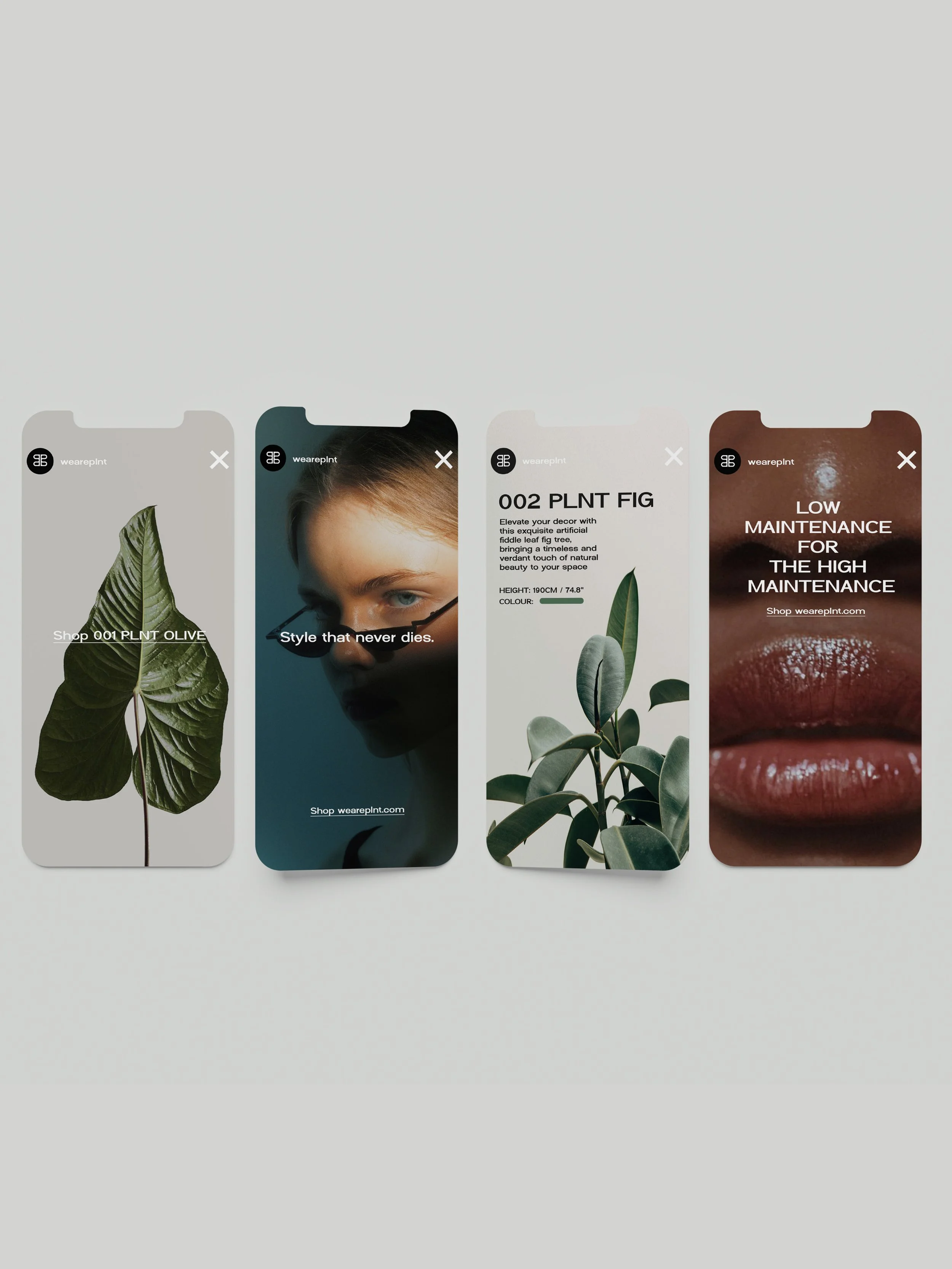
I created a distinctive brand system spanning logo, supporting emblem, typography, colour, tone of voice and art direction. The visual language deliberately moved away from typical botanical branding, combining dark, tonal plant imagery with editorial fashion photography, abstract framing and a restrained palette of soft black, stone, white and clay. The photography framework extended across editorial, ecommerce, product and lifestyle imagery, creating a flexible system that could move between brand-building and conversion.
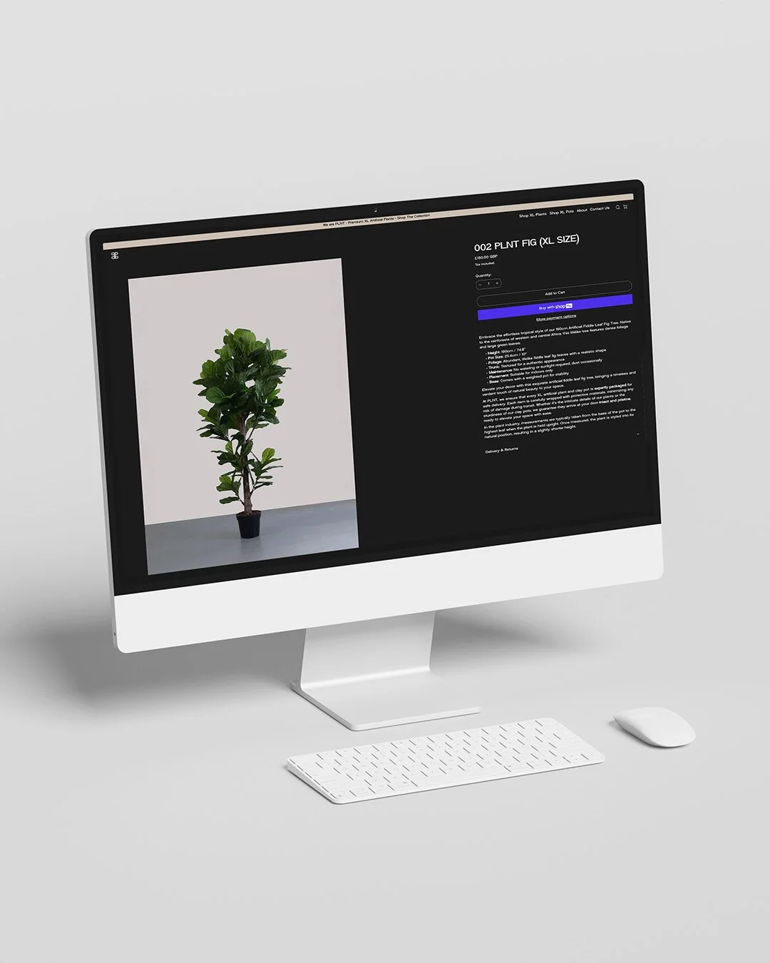
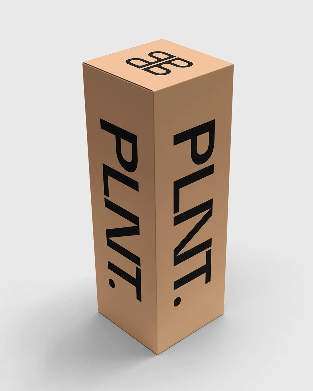
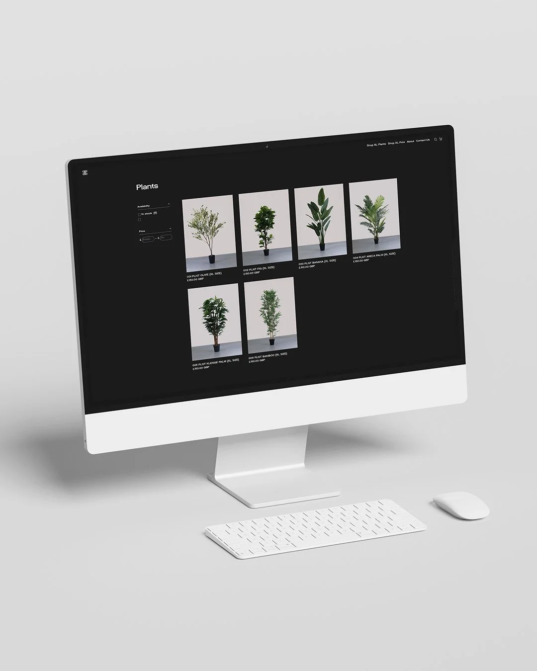
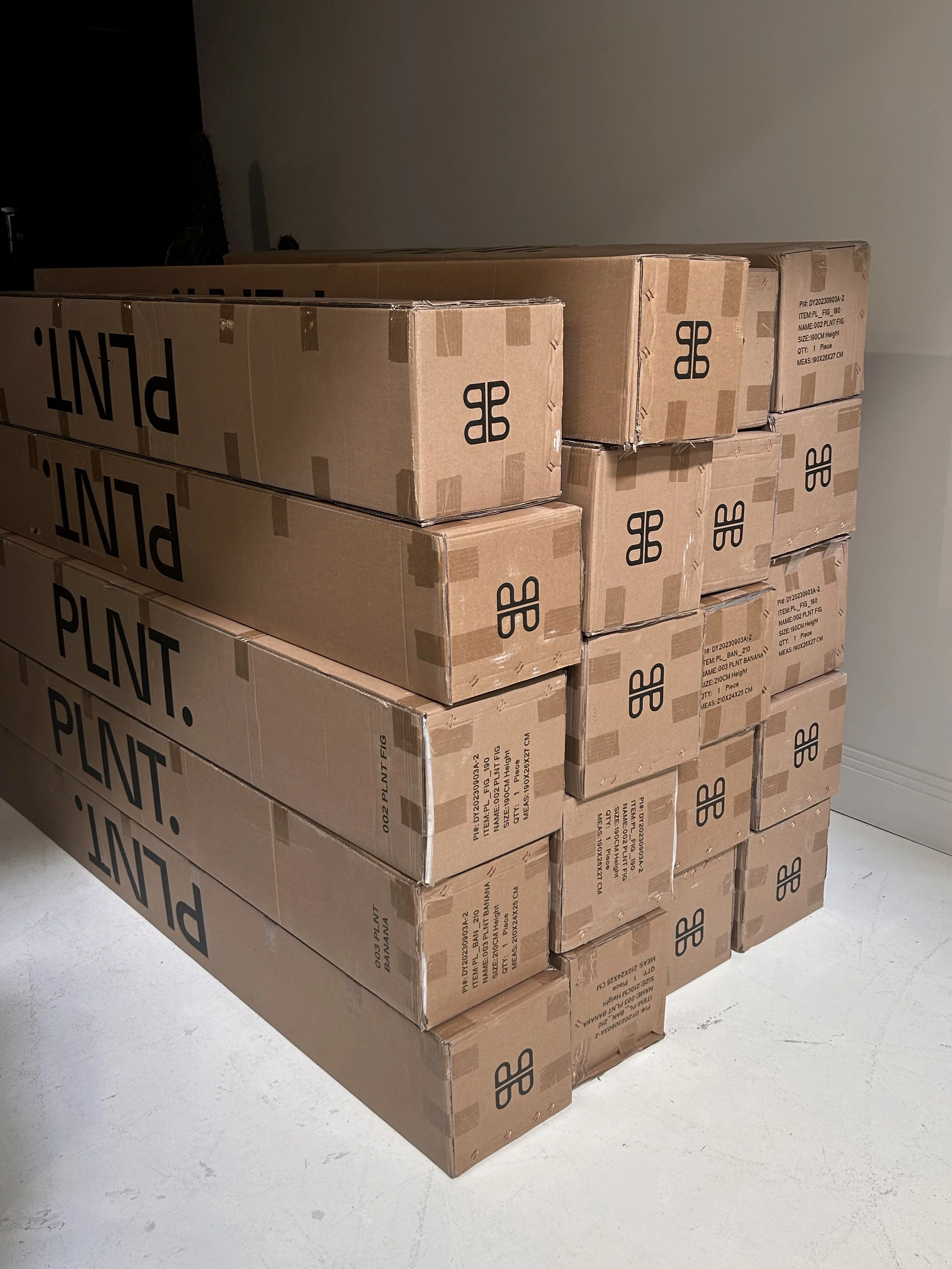
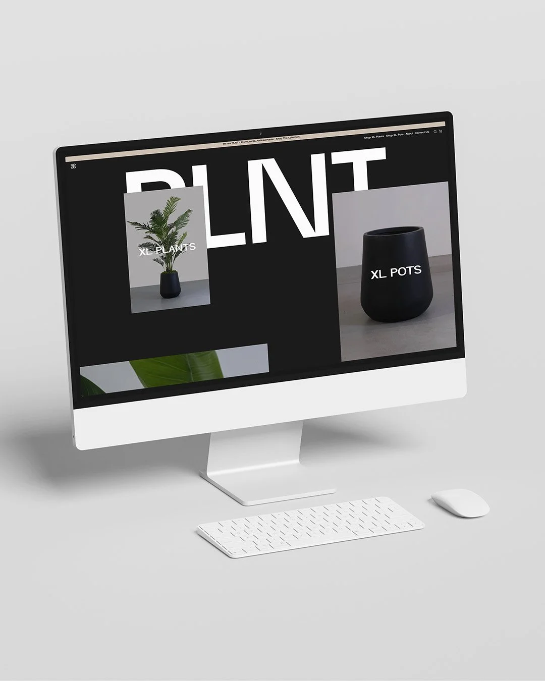
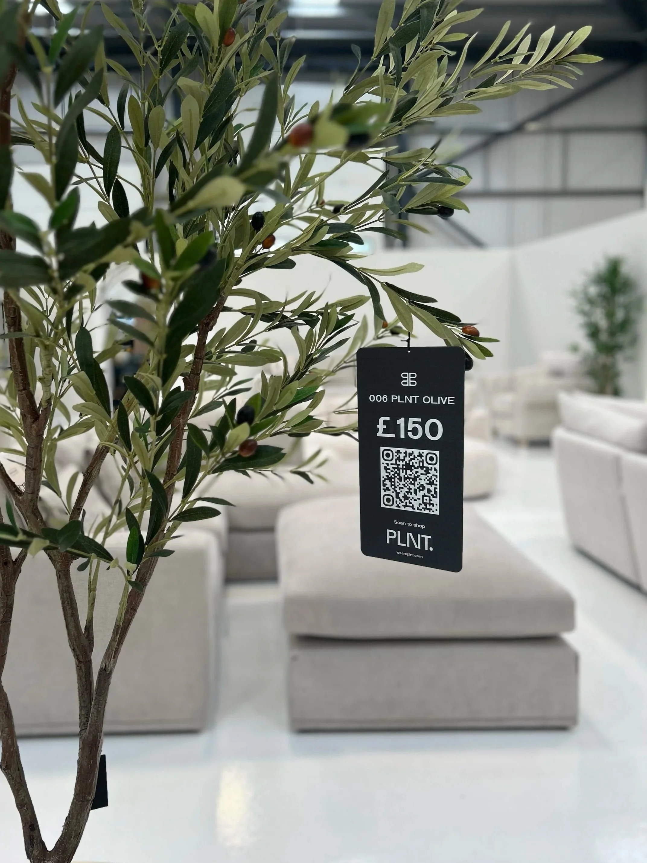
From there, I translated the identity across the full 360° customer experience; concepting and designing the ecommerce website, social channels and launch content alongside OOH, packaging, signage and physical brand touchpoints. The result was a brand conceived as one connected world from day one, rather than an identity applied retrospectively to a product.
VISION